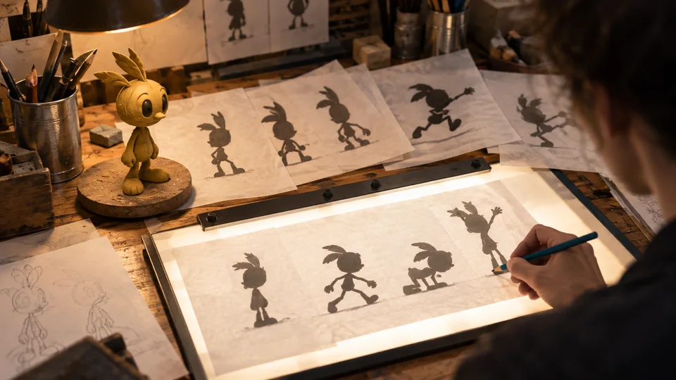
There is a test that animation departments have been applying to character designs for the better part of a century, and it is brutally simple. Fill the drawing in solid black so that all interior detail disappears. If you can still tell who it is, what they are doing and roughly how they feel about it, the design works. If you cannot, no amount of rendering will save it. The silhouette test survives because it isolates the one question that matters for a medium built out of single frames: does this read instantly, at small size, in motion, to somebody who is not looking very hard.
The shape does the work
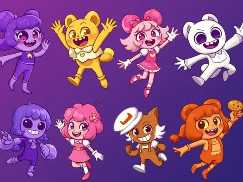
Human vision resolves outline before it resolves detail. A viewer watching a character cross a screen has a fraction of a second per frame and is not studying the drawing; they are recognising a shape and moving on. Everything about traditional character design follows from that constraint. Cast members are given distinct overall proportions so that no two produce the same blob. Poses are staged so that limbs break the body's outline rather than crossing in front of it, since an arm held against the torso vanishes while an arm held clear of it reads from the back of the room. Props are shaped to be identifiable in outline alone.
This is not a stylistic preference; it is a legibility requirement, and it becomes more severe as the frame gets smaller. A design that only works at cinema scale fails on a phone. Studios that expect their work to be watched on both design for the worse case, which is one reason contemporary character designs have grown bolder and simpler rather than more detailed as rendering technology has improved.
Model sheets and the consistency problem
Animation has an organisational difficulty that live action does not. An actor arrives on set as themselves, and continuity is guaranteed by the fact of their body. An animated character is drawn thousands of times by a large number of different hands, frequently in different buildings and increasingly in different countries, and there is nothing to stop them drifting.
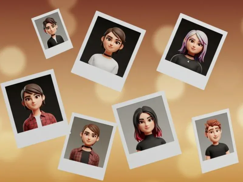
The model sheet is the instrument that prevents it: a reference document showing the character from multiple angles, at standard proportions, with construction guides, a range of expressions, and comparative height against the rest of the cast. Studios treat these as production law, and the discipline they impose is easy to underestimate. Rotation sheets exist because a character has to remain the same volume when they turn. Expression sheets exist because a face redrawn from imagination will slide. Comparison charts exist because relative size is a large part of how audiences read a group at a glance, and once it drifts the cast stops feeling like a cast. Collections holding original production material, including the Walt Disney Family Museum and the animation holdings of the Academy Museum of Motion Pictures, preserve these documents alongside the finished films, which is a fair indication of how central they are considered to the work rather than incidental to it.
The economics that forced the style
The other great pressure on readability was money. Full animation, in which a new drawing is made for every frame or every other frame, is extraordinarily expensive per minute of screen time. It was affordable for theatrical shorts and features. It was never remotely affordable for the volume of material that television began demanding in the 1950s.
What emerged is usually called limited animation, and its techniques are all reductions in drawing count. Hold the body still and animate only the mouth. Reuse walk cycles. Break characters into separately movable pieces so an arm can be re-posed without redrawing the torso. Shoot on threes rather than twos. Stage scenes so that action happens off screen and is described rather than shown. The style is often discussed with an audible sneer, and it has an unresolved argument attached: some accounts treat the flat, graphic look associated with the more design-led studios of the period as a genuine aesthetic programme influenced by contemporary painting and poster art, while others treat it as a budget constraint retrospectively dressed as a choice. The honest answer is probably that both are true of different studios and different films, and the historical record does not resolve it neatly.
What is not disputed is the effect on design. When you cannot afford movement, every drawing has to carry more information, and characters become more graphically extreme, more sharply differentiated and more instantly readable. Poverty produced clarity, and the clarity outlasted the poverty.
Colour as a plan rather than a decision
Colour in animation is not chosen shot by shot. Feature productions typically develop a colour script early: a sequence of small paintings, one or a few per beat, laid out in order so that the entire film's palette can be assessed as a single arc before anything is finalised. It functions rather like a musical score in that its subject is change over time rather than any individual moment.
Two things follow. First, character palettes are assigned against the world rather than in isolation. A protagonist is usually given a colour that appears nowhere else in the environment, which is why the eye finds them in a crowded frame without conscious effort. Second, the emotional grammar of colour in a film is comparative, not absolute. A scene reads as cold because the preceding sequence was warm, not because of anything intrinsic to the hue. Analyses of how audiences read designed characters, including work on genre and perception in character development for film and television, treat colour alongside shape and proportion as part of a signalling system that audiences decode very rapidly and largely without noticing, which is exactly why it can be manipulated so precisely.
Why exaggeration reads as truer
The counterintuitive rule of the whole craft is that accurate proportions look less like a person than distorted ones. Push the jaw, widen the eyes, shrink the mouth, extend the reach of a gesture beyond anything a body could manage, and the result is not merely more appealing but more recognisable.
There is experimental support for this. Research in cognitive psychology on the identification and rating of caricatures found that caricatures, which exaggerate the ways a face deviates from an average, can be recognised as effectively as accurate representations and are sometimes rated as better likenesses than the originals. The proposed explanation is that memory encodes what is distinctive about a face rather than its literal measurements, so amplifying the distinctive features moves the image closer to the stored representation, not further from it. Caricature is not a departure from reality; it is a shortcut to how reality is filed.
Animators arrived at the same conclusion empirically decades before anyone tested it, and codified it in the working principles that were eventually written down by the discipline's senior practitioners and later restated for computer animation in a 1987 paper presented at SIGGRAPH. Exaggeration sits in that list alongside squash and stretch, anticipation, staging, follow-through and appeal, and the through-line connecting them is the same as the silhouette test: the drawing is not competing with reality, it is competing for the audience's attention, and it has one frame in which to win.
Which is why the flattest, simplest, least anatomically defensible design will beat a meticulously rendered one nine times out of ten. The medium's whole history, from the model sheet to the television budget crisis to the colour script, is a long argument in favour of clarity over accuracy. Institutions such as the British Film Institute have spent decades preserving and programming this material, and what the archive shows is a craft that discovered very early that the job was never to reproduce a person. The job was to make somebody unmistakable in a hundredth of a second, over and over, without the audience ever noticing the effort.